Declarations are not evidence.
WonderPlan is small enough to inspect end to end and complicated enough to drift from its own rules, which is exactly what makes it useful.
One finding settled the approach. A tab target had been declared at 44 pixels — correct in the file and correct against the standard. An ancestor's clipping behaviour reduced the actual usable reach to 24.5 pixels.
No amount of reading the CSS would have surfaced that. Measuring the rendered interface did.
Declaring a hit area is not having one.
Declared is not
the same as usable.
Historical clipped hit-area finding · Explanatory measurement
So the audits were rebuilt to measure reality.
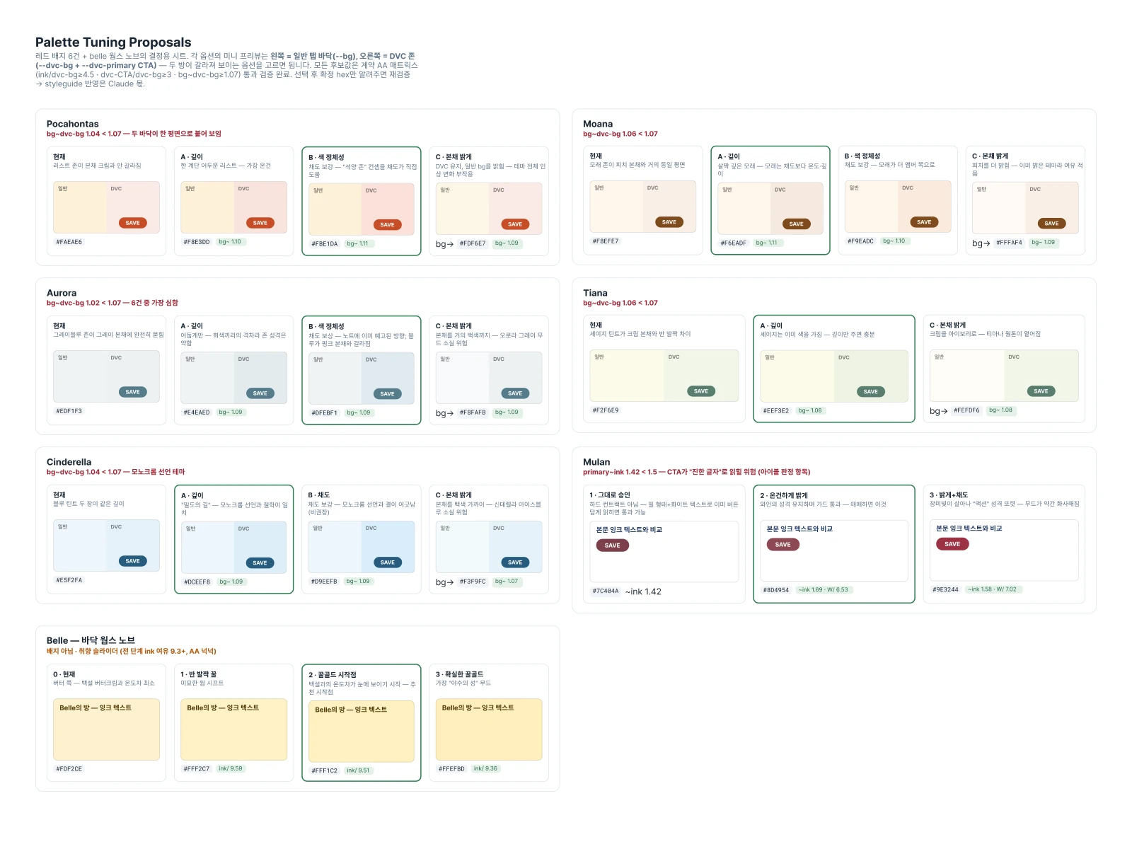
Contrast checks now measure the colour actually painted — resolving transparency and walking up to whatever background sits behind the element — across all sixteen themes, rather than comparing token values to each other. Touch-target, focus, viewport, and Figma-binding audits each check a different part of the system against rendered behaviour.
The same standard went to the documentation. Fifteen backlog items were reconciled against the code and eight described the implementation inaccurately. A wrong line number is worse than no line number, because it reads as authoritative and sends the next person confidently to the wrong place.
Two accessibility shortfalls are recorded with their measured values rather than quietly corrected. Publishing the misses is most of what makes the rest of an audit believable.
A product rule, expressed in tokens.
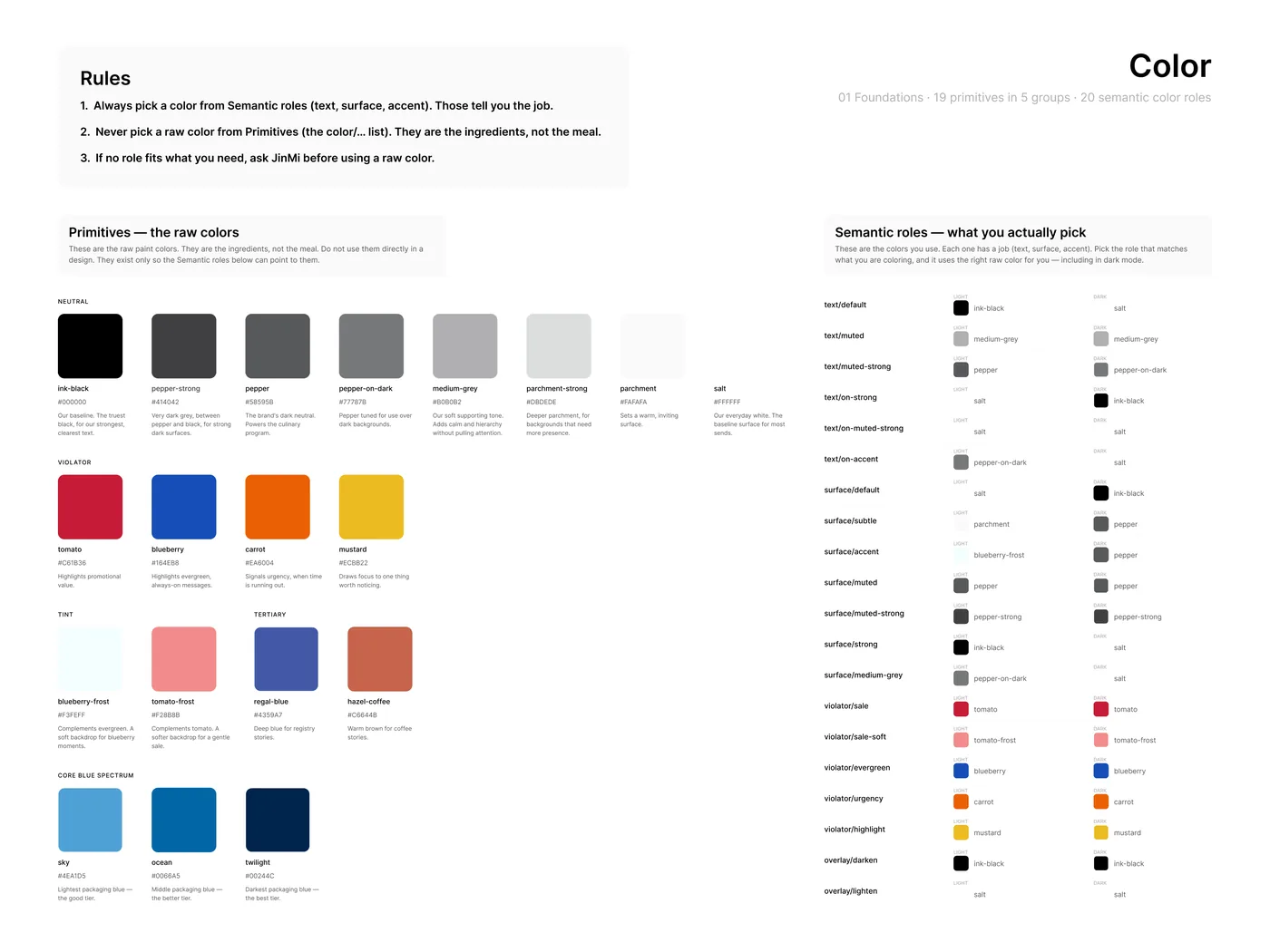
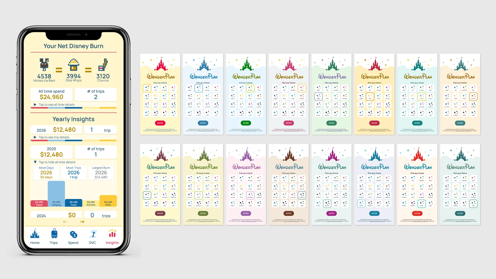
Five swatch roles govern sixteen themes; tone fitting adjusts lightness only, so hue and saturation keep their source values. Figma variables and CSS variables are bound one to one by name, which is what makes a design change traceable into rendered output at all.
The decision I would defend hardest is a colour that deliberately does nothing. A single neutral attention role replaces the usual positive, warning, and danger set, because this app displays money and must not editorialize the person spending it — never good or bad, over or under, success or failure.
That is not a visual preference. It is a product rule that happens to be expressed in tokens, and it is the kind of thing you only notice once you have built enough of the surrounding system to see where the two meet.